Winners, Covers, and a Reveal!
Lots of fun stuff today, so let’s get to it!
First off, the winners from the two recent giveaways were:
Sadie won the Mother-Earth Series Omnibus ebook from the “Pick a Jenni” contest and
bookaholicholly won the signed paperback of Knot in Time from the Summer Splash Blog Hop!
Congratulations ladies and I hope you enjoy the stories!
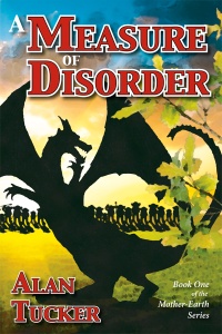
All right! Let’s talk about book covers. As you may know, I have been working on a redesign of A Measure of Disorder, the first book in the Mother-Earth Series. This book was first published in April of 2010 and this isn’t the first time it’s had an extreme makeover. Although I am a graphic designer as my “day job” I hadn’t had much experience with book covers. Unfortunately, my inexperience showed with the book’s first cover.
My intention for the artwork was to create a stylized, watercolor look. It certainly didn’t come off, especially at smaller sizes, which I’d failed to consider in the design. Tip #1: Make sure your cover looks good and is clearly visible/readable at thumbnail sizes as well as full size.
I experimented with this cover briefly for the ebook only.
I wanted something more exciting, but the flames just never looked right and I had a couple of people who were disturbed by the image of someone on fire — even though this scene does happen in the book, there is a difference between reading about something and actually having a graphic representation of it. Tip #2: Do some widespread polling/opinion gathering of your cover options/ideas. Get as many opinions as you can, especially from people in your target audience. Don’t rely simply on close friends or family members. Just as with critiquing your writing, they may not be completely honest with you for fear of hurting your feelings.
The third iteration is better and has served well for almost two years, but I was still stuck on trying to depict a scene from the book.
My good friend, Clint Thorne, had created a stunning image for the second book, A Cure for Chaos, and I kept feeling like the cover for the first book didn’t muster up. Time constraints hadn’t allowed Clint to do more artwork and budget constraints forced me to continue creating on my own. I’ve been happy with this cover for the most part, but it just doesn’t have the punch I’d like. All the great fantasies I read through my teens and twenties nearly always had a painting depicting a pivotal scene from the story on the cover. I failed to heed that times change. Yes, many fantasy stories still have covers that follow that convention, but most have moved toward artwork of a more graphical nature. A Game of Thrones is a great example of this. Tip #3: Unless you have access to an outstanding, professional artist, don’t try to depict a scene from your book on the cover. In most cases, it will turn out looking amateurish and unprofessional.
Focus on what’s important. Title and author name should be easily identifiable and read, even at small sizes. Color is crucial. It, along with any images you choose, can convey the type of story contained in the book. Finally, experiment. If sales seem to be lagging, maybe it’s time to freshen things up! So, without further ado, I present the new cover for A Measure of Disorder:
There will probably be more minor tweaking done between now and the time I need to order more print copies of the book, but I’m pretty happy with this result. As those of you who voted can see, Jenni #3 was the winner, hands down. I think she captures the spirit of the character pretty well. And thanks to Austin at ReadingTeen.net for his fantastic review of this book that I’ve treasured these past three years or so!
Okay, there it is! You’ve heard about what I think, now it’s time to let me know what you think. Don’t hold back. If you think it’s terrible, say so! But tell me why you think the way you do. That’s the only way we can learn!
Posted on August 1, 2013, in Books/Writing and tagged artwork, book covers, books, covers, literature, tips. Bookmark the permalink. 3 Comments.


I think you’ve captured the heart of your story well in this image, Alan.
Thank you so much! I feel like it does too. Hopefully a fresh look will perk it up a bit. 🙂
Yup. Nailed it! High fives for your persistence, Alan!